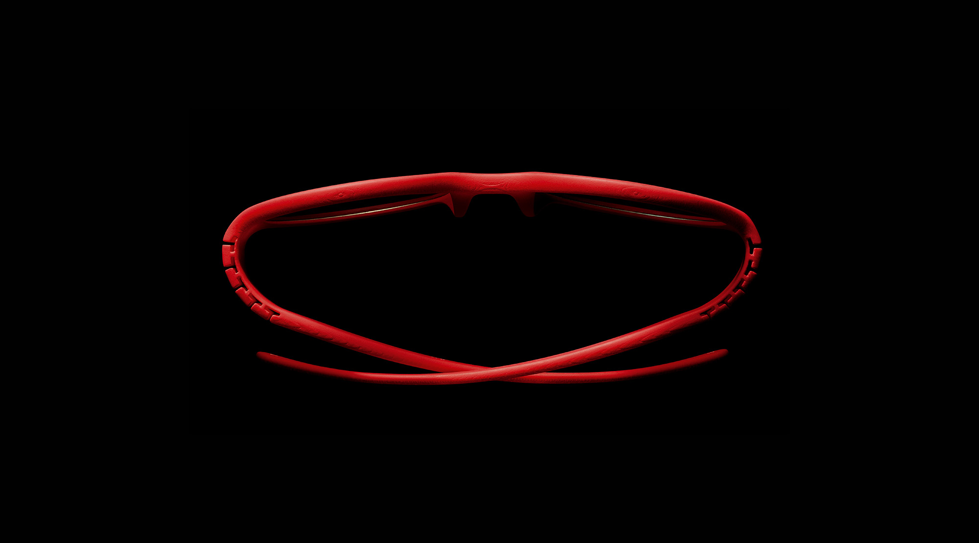
pq is a bold and brilliant eyewear brand founded by the infamous industrial designer, Ron Arad. With Arad’s killer combination of aesthetics, functionality and performance, pq glasses take on a whole new meaning for wearers. This is especially true for pq’s most innovative line: the D-frames. These frames are built using 360 scanning technology that captures the exact facial features and dimensions of any individual. pq will then 3D print monolithic frames, perfectly fitted to each scanned face. The D-frames are already a massive hit in Italy – the brand’s home country. But in early 2016, pq Eyewear decided to give America a taste of these truly “antiordinary” glasses, starting with New York City and the well-known annual CES (Consumer Electronics Show) in Las Vegas. They handed over the duty of creating their brand presentation to Squat New York.

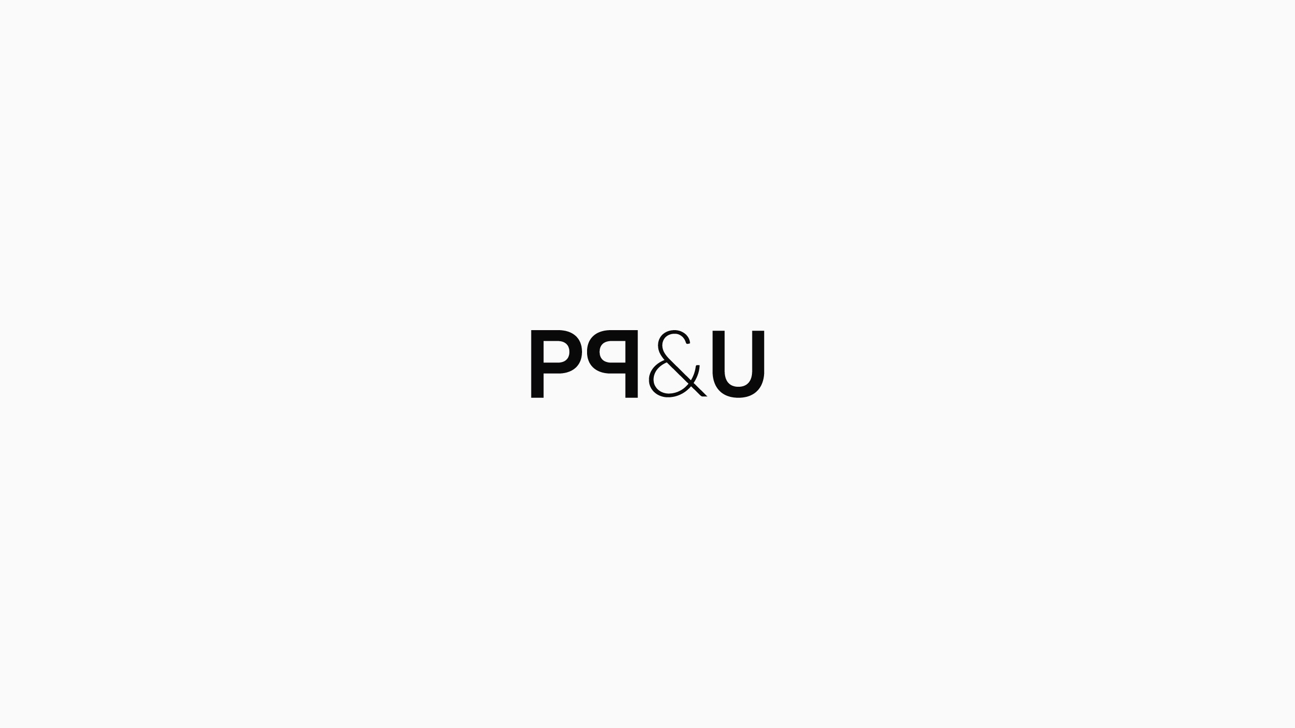
It became our job to not only impress the tech-hungry CES attendees, but a fashion capital already overloaded with successful, fashion-forward eyewear brands. Our process began with naming the sub brand something that would elicit the same feeling of engagement and connection wearers feel with these custom-made glasses. “pq&u” – with its simplicity and clever reference to the wearer-glasses relationship – practically hit us over the head. We then crafted a sophisticated new logotype that seamlessly incorporates “&u” with the original name.
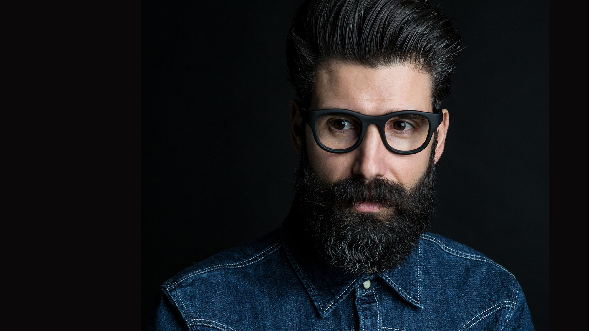
To give newbies a brief, yet intimate glimpse into the world of pq, Squat New York created a 1-page website filled with strong, clean visuals and catchy copy. The opening animation provides a step-by-step view into the customization process of facial scanning and designing. Visitors are able to get a real sense of the cutting-edge technology and meticulous detail that goes into these frames. If the animation isn’t enough to convince the audience of the brand’s commitment to quality, our tagline “Meticulously crafted. Tailored to perfection.” should be.
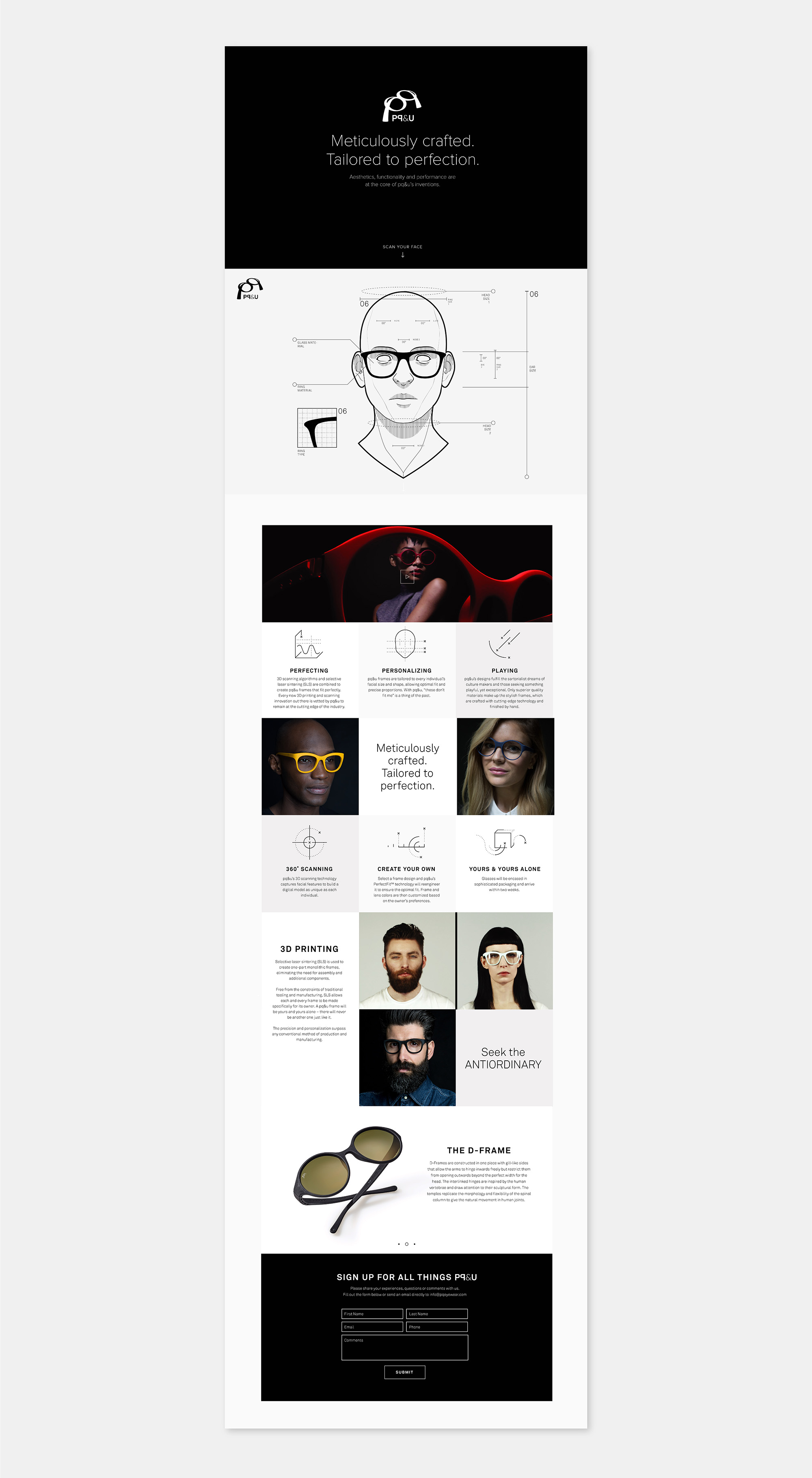
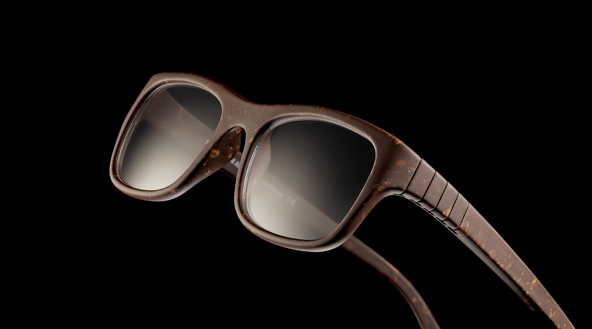
Further down, visitors learn the brand’s core qualities and values through a series of icons and matching text. By sculpting the icons with gentle, simple lines, we were able to give more attention to the glasses themselves. For the same reason, we limited the color palette to just black, white and gray, leaving the brightly tinted frames the only real splashes of color. We even grabbed images and video clips of pq models displayed in their Italian shops, teasing visitors with a fun glimpse of the brand’s store experience.
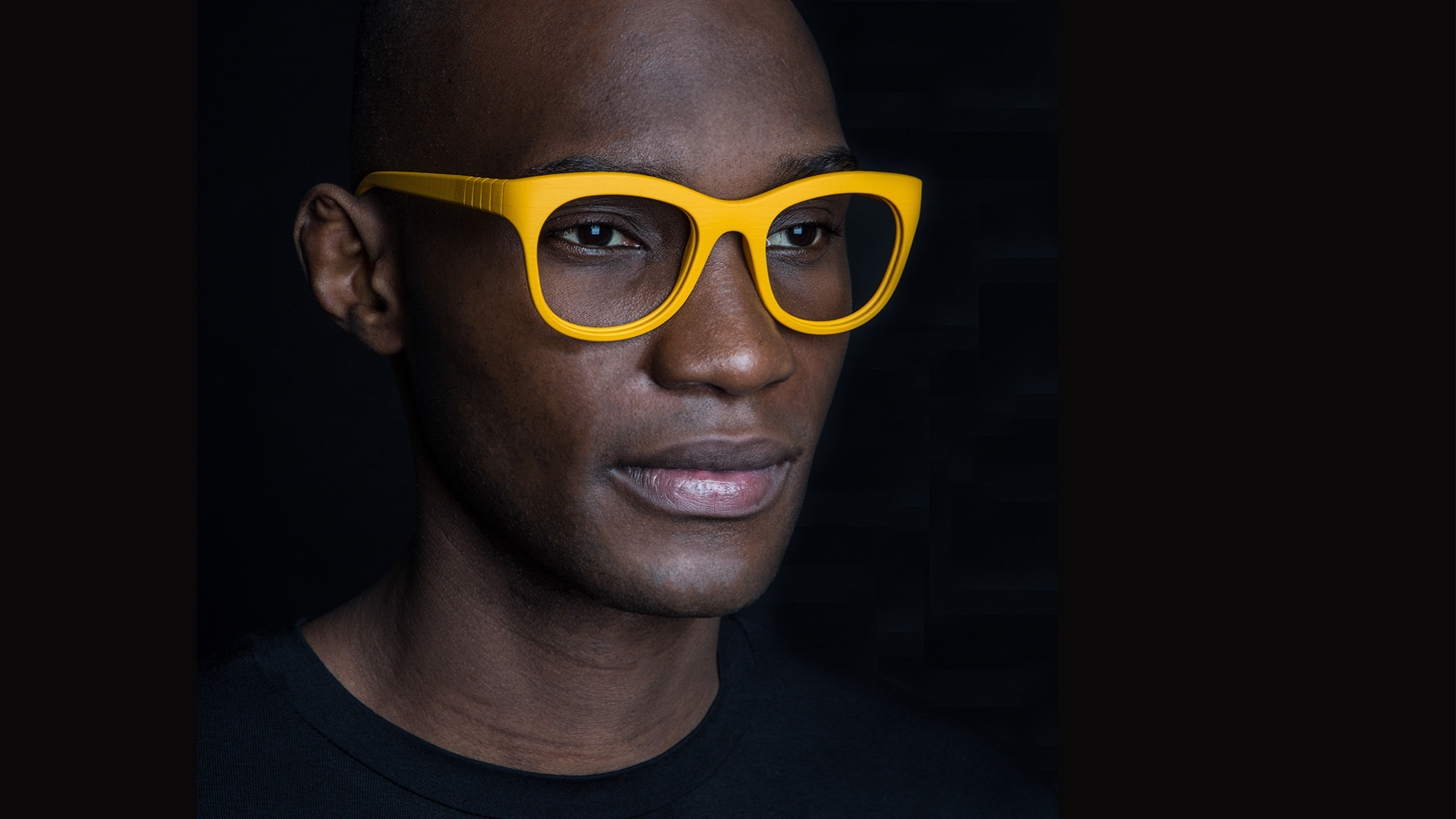
Now equipped with an elegant set of assets to help communicate the quality and uniqueness of the brand, pq is well on its way to becoming one of the leading eyewear companies in the U.S. market.
Thanks! You have been successfully added to our mailing list. Expect a confirmation e-mail shortly.
Sorry, we weren't able to sign you up. Please check your details, and try again.
We will be in touch with you shortly.