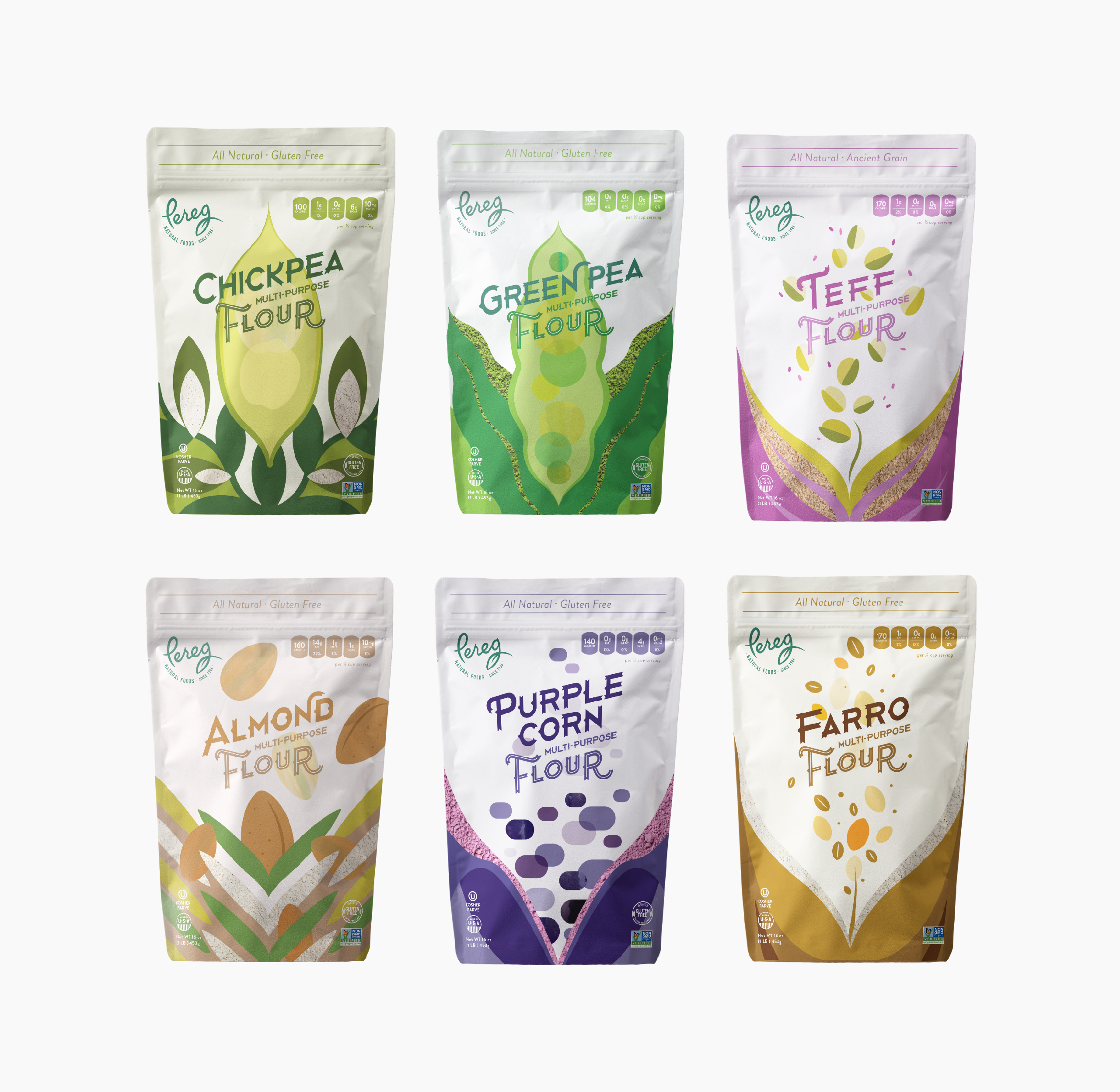
For over 100 years, the artisans and gourmet experts at Pereg Natural Foods have scoured the world in quest of superior quality, all-natural ingredients to bring to the table of every family. After making the jump from Israel to America, Pereg needed a hand introducing dozens of Israeli-style product lines to a completely new market – the latest of which includes a wide range of multi-purpose flours. To capture the attention of consumers unfamiliar with such unique flour varieties, we created playful and vibrant packaging designs.


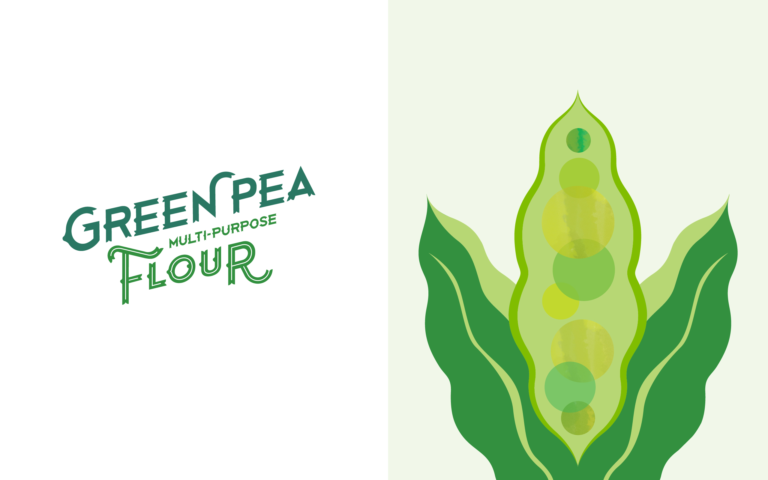
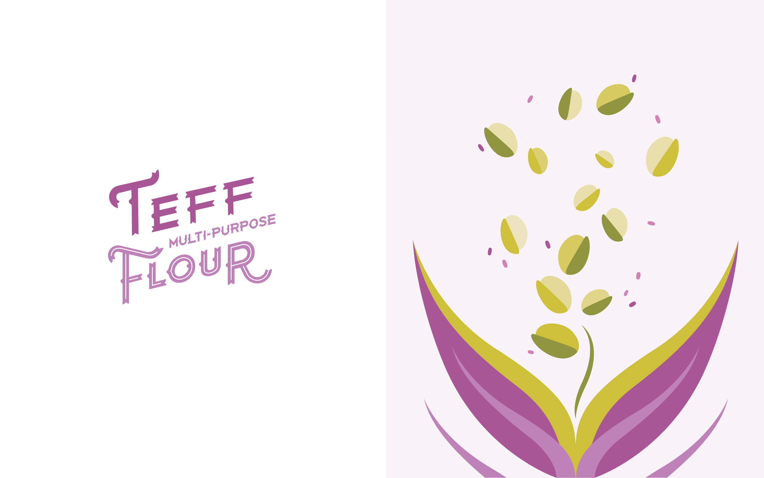
The logotype on the front and back of the packaging was crafted from an original typeface. Its ridged edges and stark colors play into the natural structure of the different foods. We then used energetic illustrations and colorful patterns to express the fresh, pure ingredients of every variety. Our bold, abstract shapes tap into their unique characters. Every shape is positioned to create a feeling of movement and fluidity. It’s as if the base ingredients are pouring into the bags straight from the fields from which they were harvested.
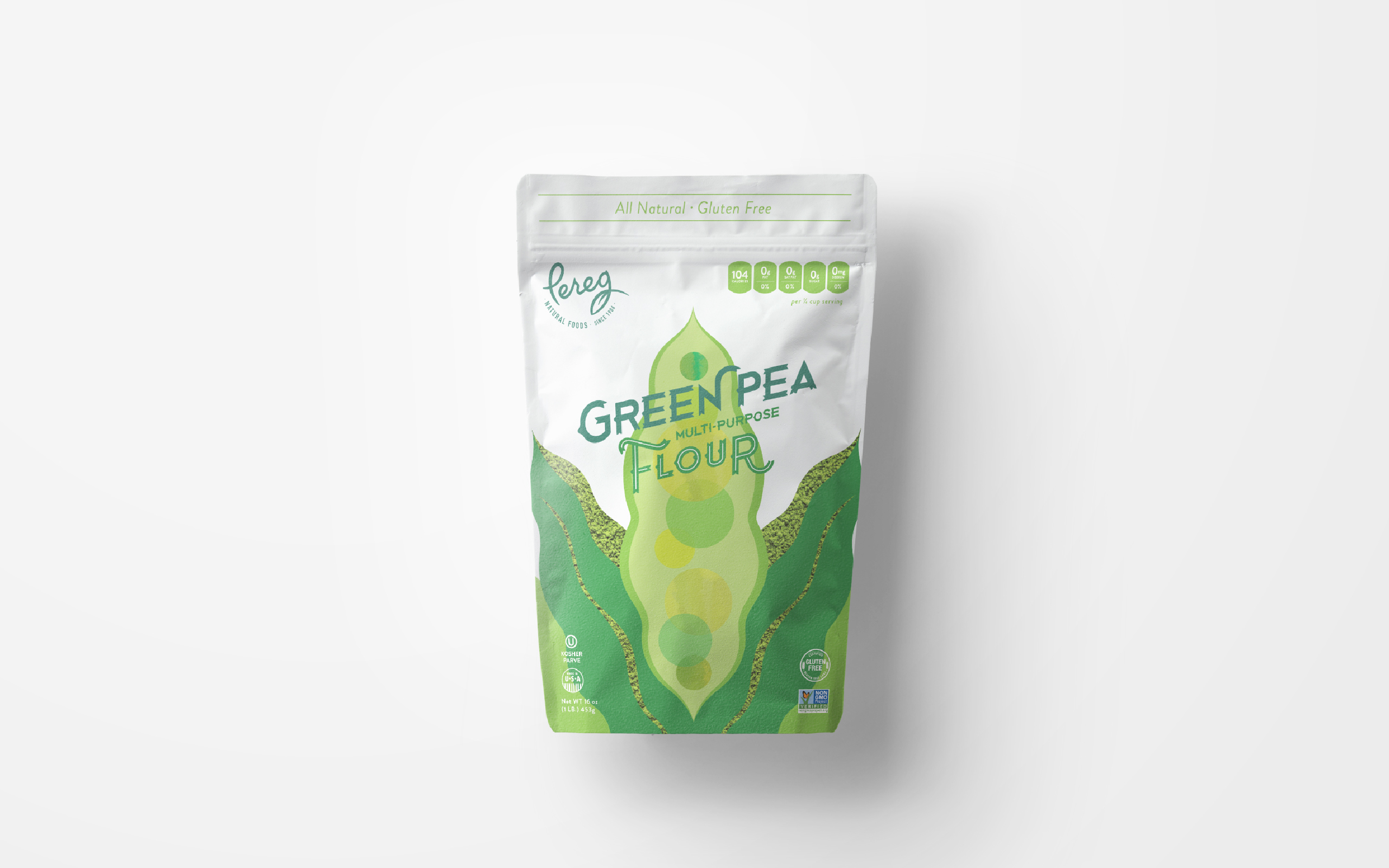
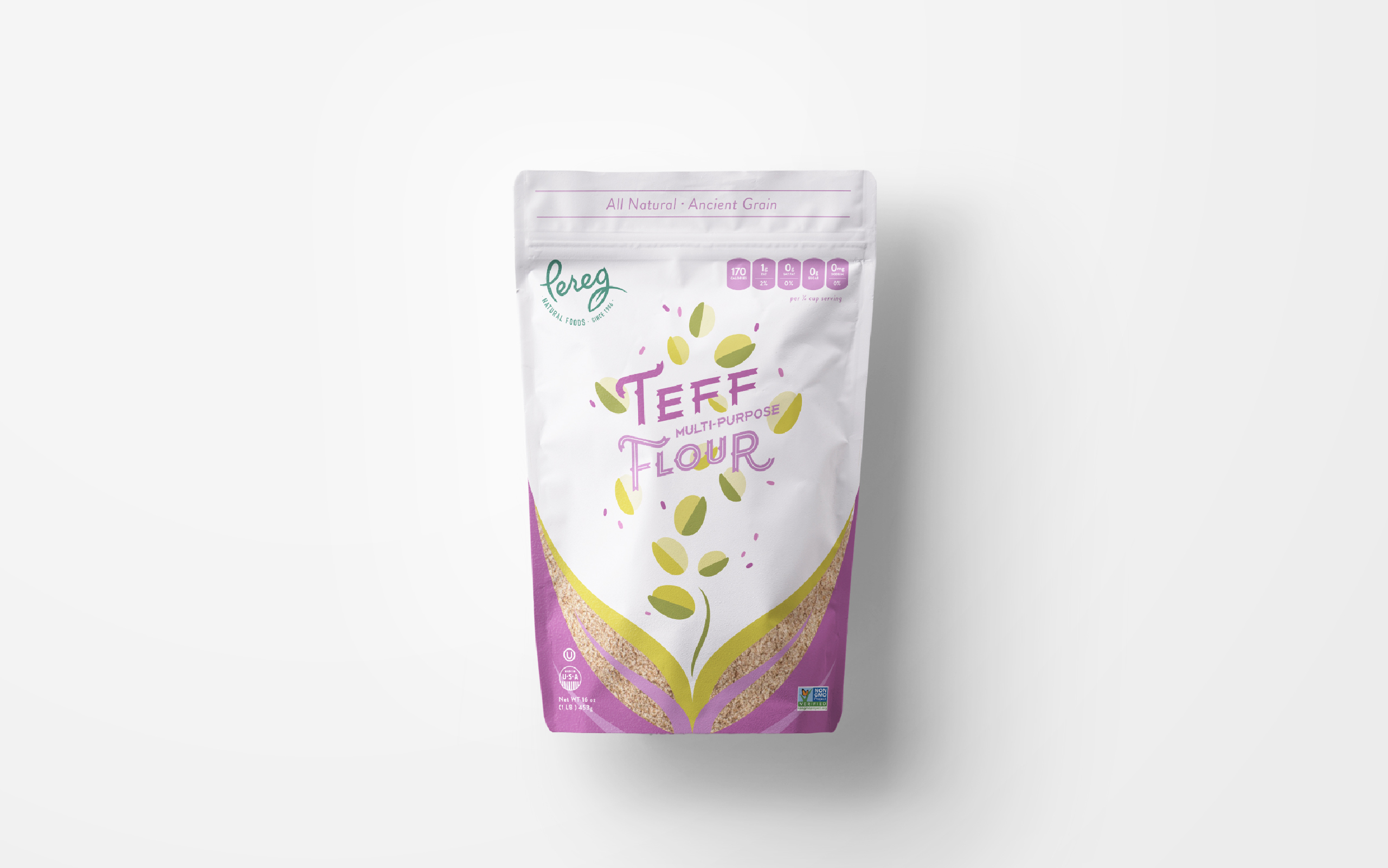
We created a harmonious link between the flour and illustrations with strategically placed windows. They also serve to reinforce the products’ texture and authenticity – what you see is what you get.

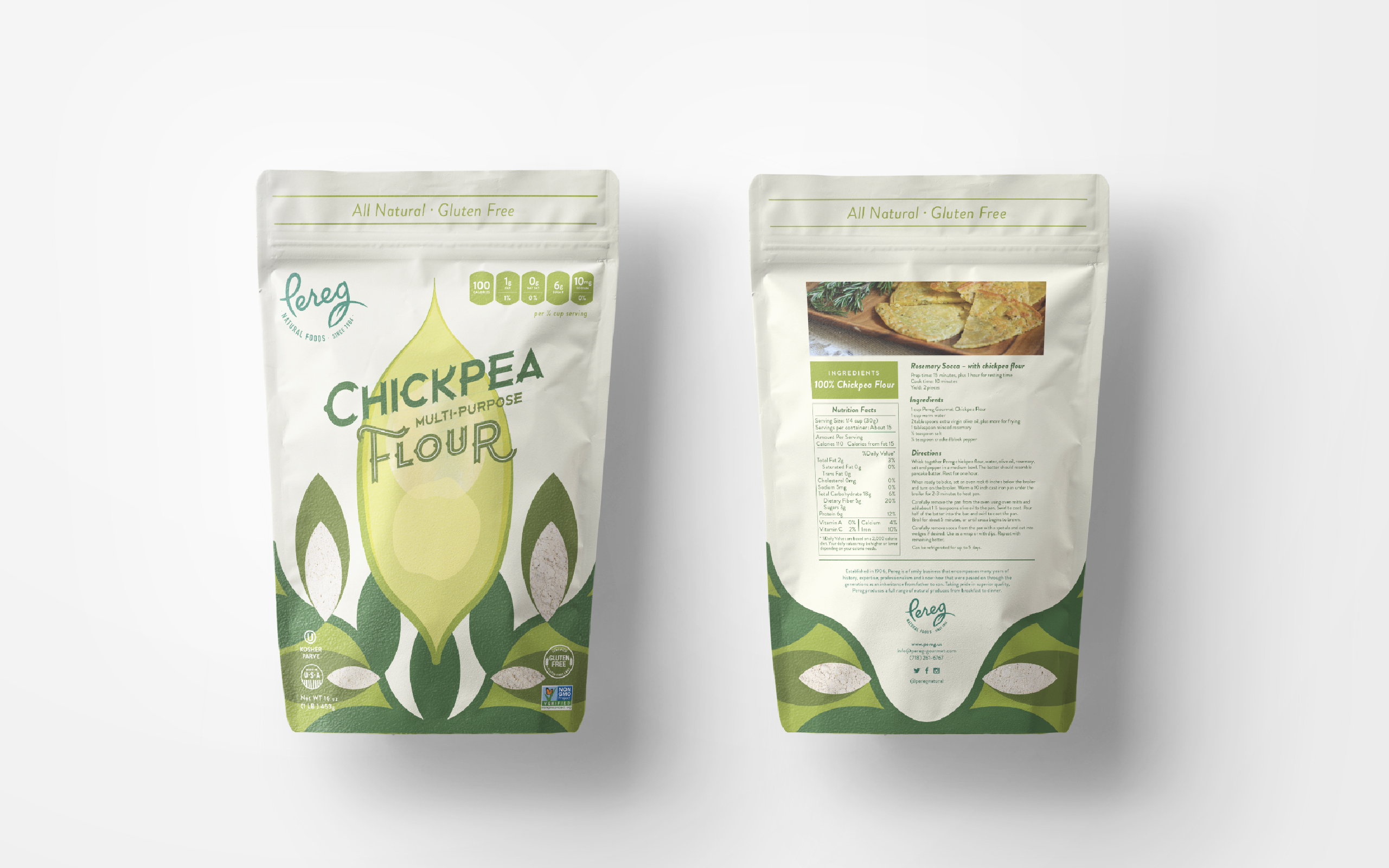
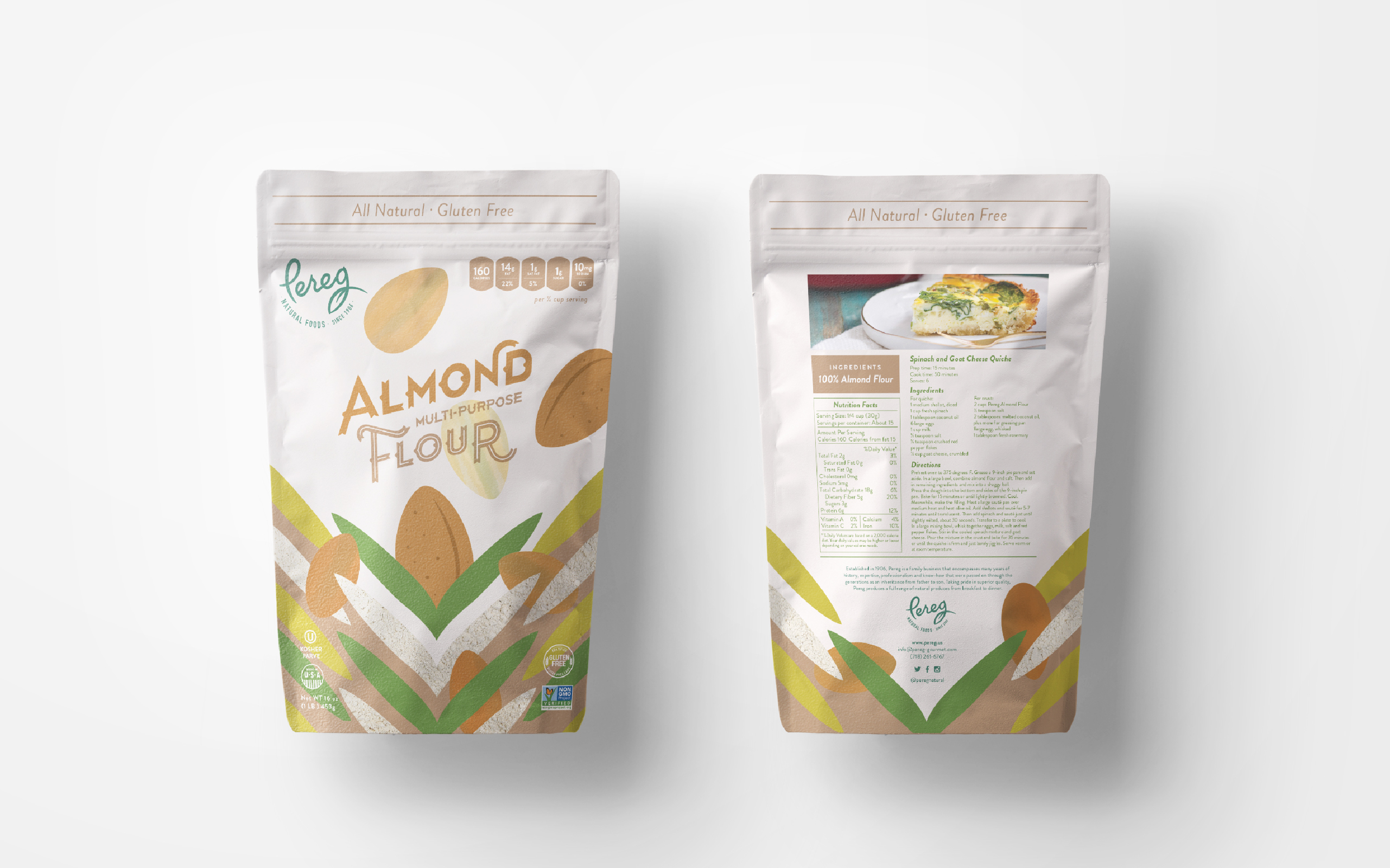
Since developing the packaging for Pereg, several large distributors have excitedly began to stock Pereg Multi-purpose Flour on their shelves. With our help, Pereg has been able to continually boost their brand awareness on a national scale.
Thanks! You have been successfully added to our mailing list. Expect a confirmation e-mail shortly.
Sorry, we weren't able to sign you up. Please check your details, and try again.
We will be in touch with you shortly.